A clear and practical guide to building a strong portfolio for the Royal College of Art Masters in Painting program.
**DISCLAIMER: This advice is personal and not official. Always check the RCA MA Painting application
page before you start for the most up-to-date requirements.
Introduction
Applying to the Royal College of Art is exciting, but putting together the portfolio can feel overwhelming. Requirements change slightly each year, so again
always check the official RCA MA Painting application page
before you start.
I graduated from RCA Painting in 2025, and over the years I have helped many prospective students and professional artists design portfolios for both applications and career opportunities. Below are five tips that address common pitfalls I have seen in portfolios for a master’s in painting.
1. Content
The portfolio should include a cover page and an artist statement, followed by a mix of full works and detailed shots. If the maximum length is 15 pages, plan for two pages dedicated to the cover and statement, with the remaining pages used to present finished pieces and close-up details.
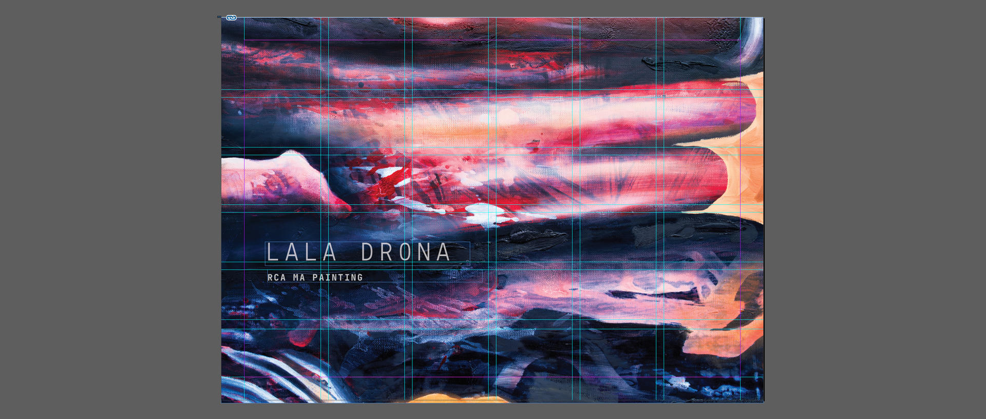
2. Cover page tip
Choosing a cover image can be tricky. In most cases, it works best to use either an installation shot of your work in a space or a full-page detail shot of one of your pieces. Both approaches usually leave enough negative space to place your name, with “RCA MA Painting” below it.
Note: Choose your font carefully. You are applying to a contemporary painting programme, so your typography should reflect that. Serif fonts tend to signal tradition and classicism, while sans-serif fonts feel more contemporary. If your work intentionally references the past, a serif can make sense, but make the choice consciously and keep the font consistent throughout the portfolio.
3. Keep it simple
It can be tempting to show personality through unusual layouts or graphics, but this often makes a portfolio feel cluttered. Unless you have professional design training, a clean, minimalist layout works best. Simplicity reads as confidence and lets the work speak for itself.
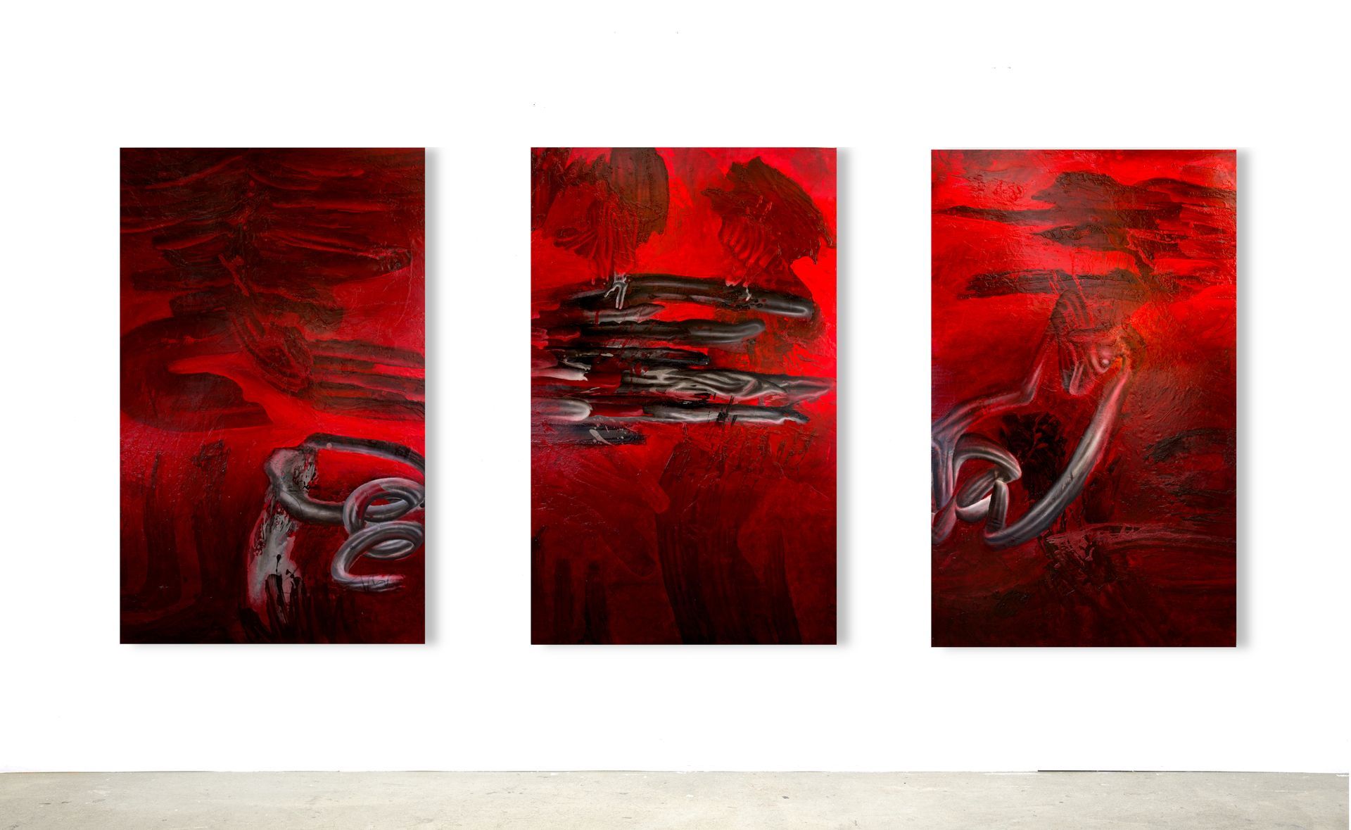
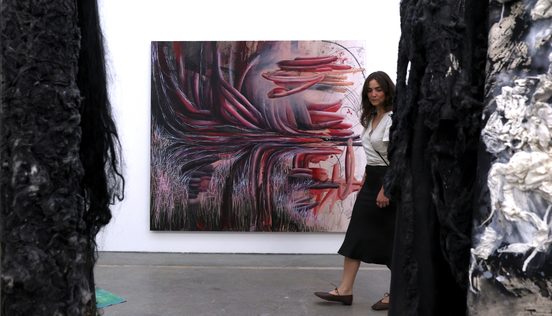
A good rule of thumb is one artwork per page, ideally shown with a single image. This keeps the focus on the work and avoids visual distractions. There are exceptions, such as showing process or time-based work across multiple images, but aim to preserve generous white space and avoid overcrowding the page.
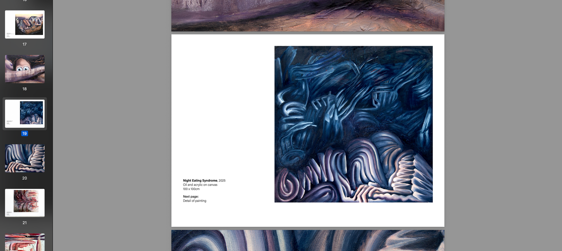
You can see this approach in the
work I developed during my RCA Master’s in Painting, where documenting the work with high-quality images was essential for building effective online portfolios.
4. Standardize
Admissions panels review many portfolios, and consistency helps them focus on the art rather than the formatting. Decide on a layout that places the artwork image and text in a clear, consistent position, then repeat that structure for every page. Predictable style and formatting makes the portfolio easier to read and demonstrates professionalism.
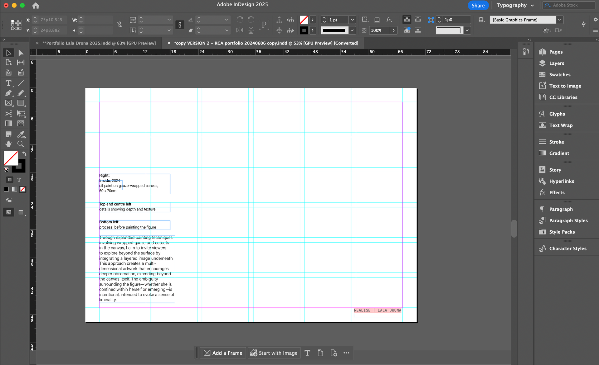
5. Use a grid
Alignment might seem like a small detail, but trained eyes notice it immediately. To keep everything precise, use software that allows grid-based layouts:
- Adobe InDesign (professional, paid)
- Affinity Publisher (affordable one-time purchase)
- Procreate
- Canva (free and beginner-friendly)
Consistent alignment communicates discipline and attention to detail.
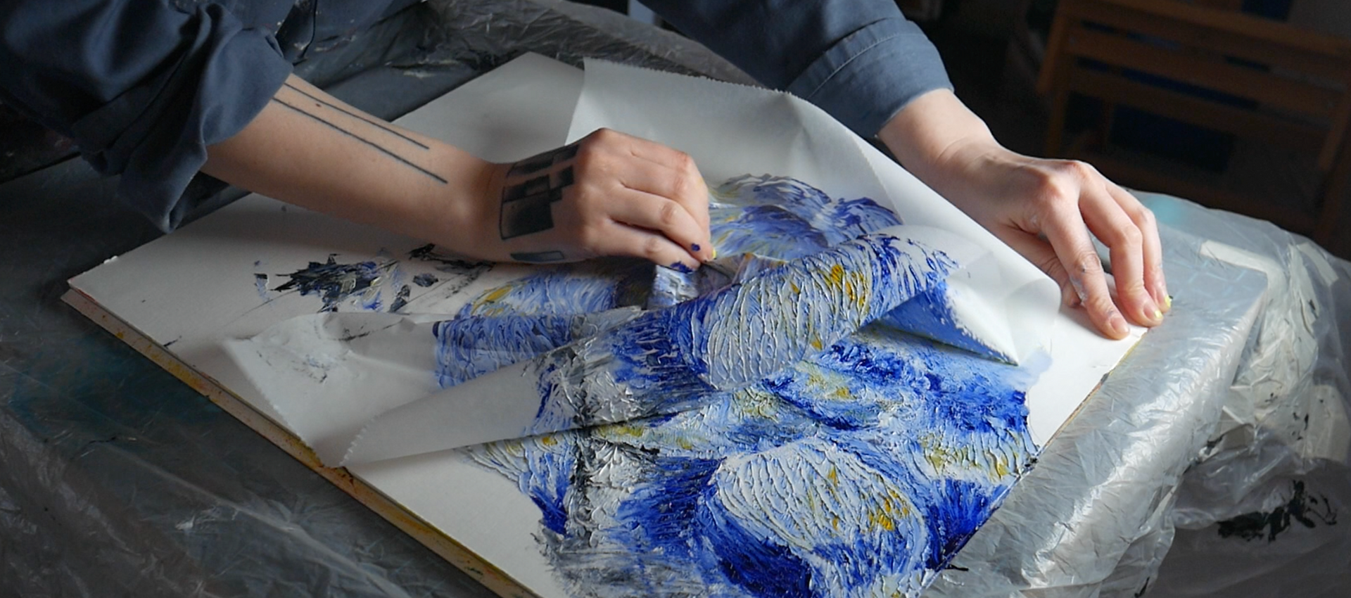
6. Process versus finished work
A common mistake is overloading a portfolio with process images. Most MA programs want to see finished work. Unless the process is integral to the piece itself, such as in performance, time-based work, or installation, focus on completed artworks. If process photos clarify the outcome and the process is unconventional rather than traditional preparatory work, include them sparingly. Otherwise, let your strongest finished works take the lead.
7. Write a short artist statement
RCA specifically asks for an artist statement as part of the
portfolio requirements. Place a short artist statement (200 words max) at the beginning of your portfolio. Write it after you have laid out your portfolio so that it reflects the work you have actually included. Avoid summarizing page by page or any phrases like "In this portfolio you will find..." or what you aspire to do during the masters program. This is simply a statement on your work. Instead, highlight the themes, materials, and approaches that define your practice. If something does not appear in the portfolio, leave it out of the statement to avoid confusing the reader.
Final Thoughts
Your portfolio should be simple, consistent, and focused on your strongest work. These principles remain constant even when specific requirements change. A clear design and confident selection make it easier for the panel to engage with your art. These are just a few tips to hopefully get you started.
Have more questions? Curious about details such as how to caption images, which fonts work best, or how to make a straightforward portfolio design that still makes an impression? I offer 1-to-1 portfolio critique sessions for artists preparing for RCA or other programs.
Book a session here.